Contents
Data Science Univariate Visualization
Data analysis is crucial to data science’s many fields. Understand the data’s structure and trends before analyzing it. Use univariate visualization. One of the easiest and most powerful tools for data analysis, it helps with distribution, trends, and features.
What is Univariate Visualization?
A dataset with one variable or feature is visualized using univariate visualization. Data with one variable or observation is “univariate”. Univariate visualization aims to improve comprehension of a variable’s distribution, central tendency, spread, and outliers.
Univariate visualizations explore the distribution and behavior of a single variable in various ways. These visualizations enable data scientists, analysts, and researchers make judgments, find anomalies, and find patterns in their datasets before using multivariate analysis or machine learning.
Univariate Visualization Importance
Data science needs univariate visualizations for several reasons:
Knowing Data Distribution: Visualizing a variable lets you know if it’s typical, skewed, or has outliers. Understanding data distribution is crucial when choosing analytical or machine learning models.
Visualization tools can identify outliers when data points diverge dramatically from others. These outliers may indicate errors, oddities, or important aspects that need additional examination.
Assessment of Data Quality: Univariate plots can show missing values, duplication, and improper data entry. Analysts can find these issues early by visually reviewing a dataset, enhancing data quality.
Making Complex Data Simple: Data is often huge and complex. Univariate visualization simplifies research by focusing on one variable at a time, helping analysts grasp and share crucial findings.
Early Analysis: Univariate visualization is commonly done before more complex analysis or predictive models. It helps identify key variables to investigate.
Common Univariate Visualization Practices
Data scientists employ numerous univariate visualization methods. Check out the most popular:
Histogram:
Histograms are fundamental univariate charts. Distributing a numerical variable into bins (or intervals) and counting data points in each bin visualizes its distribution. It’s useful for determining if data follows a normal or skewed distribution.
- Histograms are best for continuous data like ages, wages, and test scores.
Advantages: Helps identify data frequency distribution and various modes (peaks), skewness, or outliers.
Restrictions: Bin size can greatly impact histogram appearance.
Box and Whisker Plot:
For numerical variables, a box plot is another basic univariate data display. It displays a dataset’s minimum, median, first quartile (Q1), third quartile (Q3), and maximum. Outliers are shown in box plots.
- Box plots help spot outliers and compare data distributions between groups.
Advantages:Box plots show data range, central tendency, and variability. They detect outliers and skewness well.Box plots cannot show the whole data distribution or individual data point values.
Limitations:A box plot of a company’s employee salaries, displaying outliers and the interquartile range.
Plot (Kernel Density Estimation):
Density plots are smoothed histograms that depict continuous variable distribution. It refines data distribution by estimating the variable’s probability density function using kernel density estimation (KDE).
Use: Density charts are used to understand continuous variable distributions more precisely than histograms.
Advantages: Smooths histogram variability caused by binning and shows data distribution.
Limitations: The KDE’s bandwidth can over- or under-smooth the plot.Student height density plots in a classroom show if heights follow a normal distribution.
Bar Chart:
A bar chart shows the frequency or count of each category for categorical data. When analyzing discrete variables like survey responses or product categories in univariate analysis, a bar chart is beneficial.
When to Use: Bar charts are useful for comparing frequency of discrete, categorical data.
Advantages:Bar charts are simple and excellent in showing category frequency.
Limitations: Unsuitable for continuous data or distribution shape.
The Pie Chart:
Category data can be displayed in a pie chart. The pie slices represent each category’s percentage of the total.
When to Use: Pie charts illustrate category proportions overall.
Advantages:Pie charts make proportion comparisons easy and visual.
Limitations: Too many categories or similar proportions are typically criticized for being misleading.
Violin Story:
A violin plot combines box and density plots. Data distribution and probability density are shown.
Use: Violin plots are excellent for comparing continuous variable distributions across categories or groups.
Advantages: Has more detail than a box plot, making distribution shape visualization easier.
Limitations: Hard to interpret, especially for tiny datasets.
Top Univariate Visualization Techniques

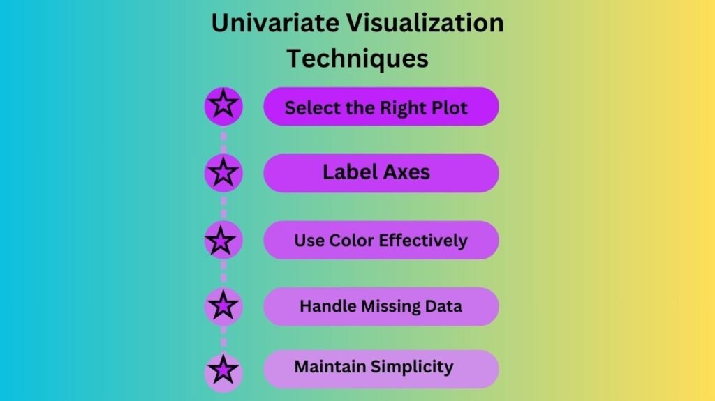
Best practices for univariate visualizations to ensure effectiveness and insight:
Select the Right Plot: Visualization style is key. Histograms, density plots, bar charts, and box plots can examine data dispersion and identify outliers.
Label Axes: Label visualization axes to clearly describe data. To ensure stakeholders and non-technical users can understand the visualization, this is crucial.
Use Color Effectively:Highlight data trends and outliers with color. Overusing colors can detract from the visualization’s message.
Handle Missing Data:Before visualizing data with missing values, address them. Impute missing values or create a missing data category.
Maintain Simplicity: Univariate visualizations should be basic and understandable. Avoid overuse of decorations and intricate designs that may confuse viewers.
Conclusion
Data scientists need univariate visualization to study, comprehend, and communicate one variable. Histograms, box plots, bar charts, and density plots help data scientists find trends, outliers, and distributions for advanced studies. Successful univariate visualization is the initial step in data analysis, ensuring that the data is comprehended and ready for additional analysis, model building, or decision-making.

