Introducing the new Google Cloud Trace Explorer
An essential component of an observability stack, distributed tracing enables you to diagnose faults and slowness in your applications. Google Cloud’s native tracing product is called Cloud Trace, which is a component of Google Cloud Observability. Google Cloud has improved the Google Cloud Trace explorer user interface (UI) and added a new analytics back end.

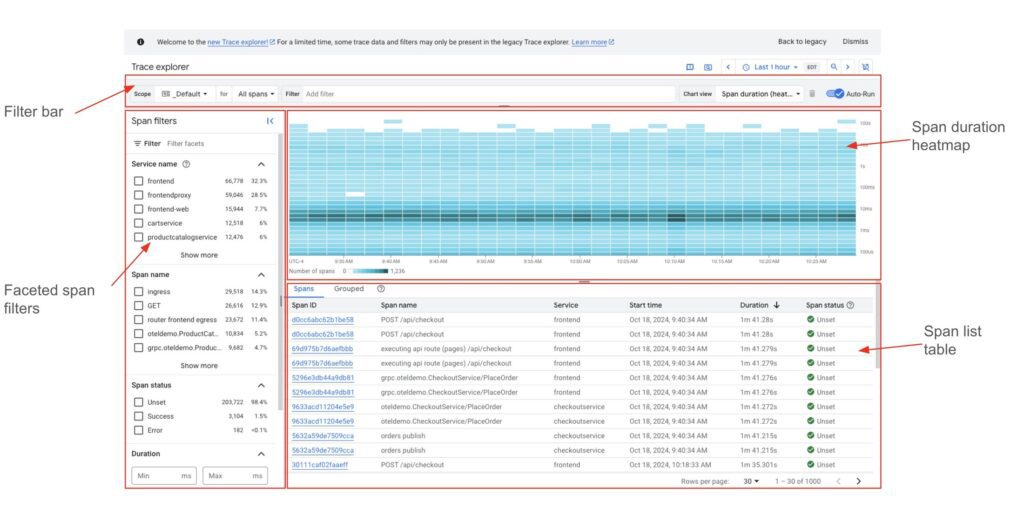
The new Trace explorer page contains:
- A filter bar where users can select a custom attribute filter, all/root spans, or a Google Cloud project-based trace scope.
- Using Open Telemetry principles, a faceted span filter window shows frequently used filters.
- An interactive span duration heat map (by default), a span rate line chart, and a span duration percentile chart are all included in this visualisation of matching spans.
- A table of corresponding spans that can be further refined by choosing a heat map cell of interest.
A tour of the new Trace explorer
Let’s examine these new features in more detail and see how you can utilise them to diagnose and fix your apps. Consider yourself a developer working on a retail web shop application’s checkout service who has been paged due to an ongoing issue.
You go to the Google Cloud Trace explorer page on the Google Cloud interface with the context set to the Google Cloud project that houses the checkout service because this application is instrumented using Open Telemetry and provides Google Cloud trace data to Google Cloud Trace.
You recall that your administrator advised using the webstore-prod Google Cloud trace scope to look into web store app-wide prod issues before you begin your inquiry. You can view spans stored in other Google Cloud projects that are pertinent to your research by utilising this Google Cloud Trace scope.
When you set the Google Cloud trace scope to web store-prod, spans from every project that is part of this Google Cloud trace scope will now be included in your queries.
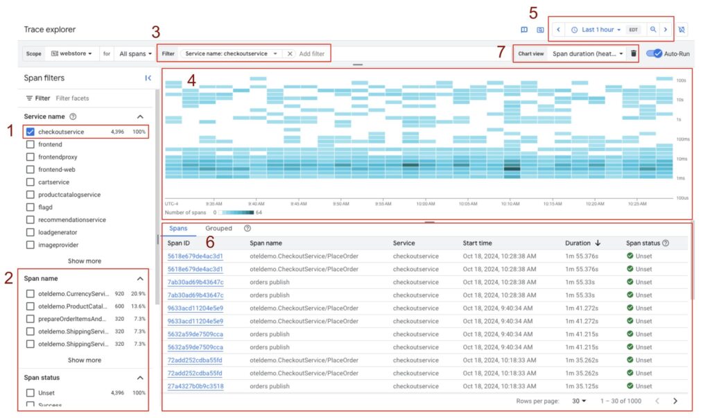
The following adjustments appear on the website when you choose the checkout service option in Span filters:

- The option made under service name is taken into consideration when updating counts and percentages in other areas, such as Span name in the span filter pane. This can assist you in becoming more exact in your search parameters.
- The active filter is shown by updating the span Filter bar.
- By default, the heat map visualisation now only shows spans from the checkout service during the last hour. The time-picker allows you to modify the time-range. Time is the x-axis of the heat map, while span duration is the y-axis. The number of spans in each cell is shown by colour tones, and the relevant range is indicated by a legend.
- Matching spans are added to the Spans table and arranged by duration (by default).
- The applied filter also updates other chart views that you can switch between.
There are some spans in the >100s range, which is unusual and worrisome, as you can see from the heat map. However, you are initially interested in the volume of calls handled by the checkout service and the associated delay.

By switching to the Span rate line chart, you can see how much traffic your service handles. Time is represented by the x-axis, and spans/second by the y-axis. Since you know from previous experience that 1.5–2 spans/second is very average, the traffic handled by your service appears to be normal.
The p50/p90/p95/p99 span duration trends by switching to the Span duration percentile chart. The p9x durations are longer than you anticipate for your service, even though the p50 appears to be fine.
Returning to the heat map graphic, you pick one of the outlier cells to look into more. It’s alarming because this specific cell has two matching spans that are longer than two minutes.
By looking at the complete Google Cloud trace, you can examine one of those spans and see that the orders publish span is the one that takes up the most time when processing this request. In light of this, you speculate that the checkout service is experiencing problems with these kinds of calls. You use the X button to quit this Google Cloud trace after noting that the rpc.method attribute is Place Order in order to verify your hypothesis.
You add an attribute filter. Using the Filter bar, method value: PlaceOrder reveals that your service is clearly experiencing latency while handling Place Order calls. You notify the SRE team of the necessary steps to mitigate the incident because you have previously encountered this problem and are aware that there is a run book that covers it.
Behind the scenes
Big Query, the same platform that supports Log Analytics, powers this new experience. It intends to introduce SQL queries, export, flexible sampling, and regional storage as new capabilities that fully utilise this platform.
In conclusion, service-oriented investigations can be carried out using the new Google Cloud Trace explorer, which offers sophisticated querying and Google Cloud trace data visualisation. This enables developers and SREs to find mitigating steps to restore normal operations and debug production events effectively.
Cloud Trace pricing
| Feature | Price | Free allotment per month | Effective date |
|---|---|---|---|
| Trace ingestion | $0.20/million spans | First 2.5 million spans per billing account | November 1, 2018 |
