Use the improved BigQuery data canvas to expedite the process of turning data into insights.
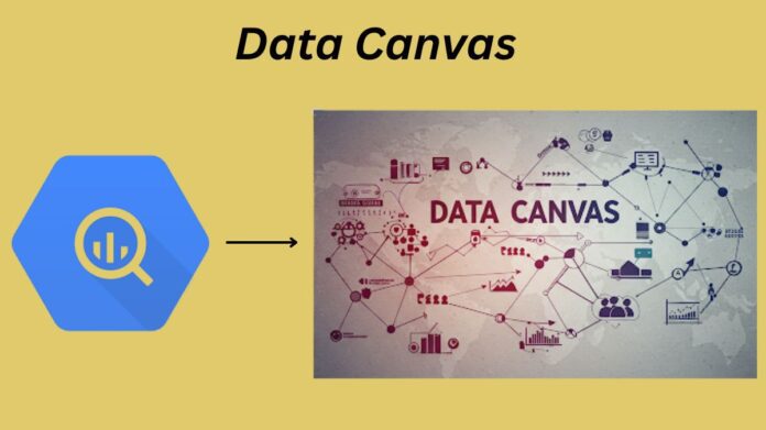
The capacity to swiftly derive significant insights is critical in today’s data-driven environment. The process of turning raw data into useful intelligence, however, is difficult for many. Progress is frequently hampered by intricate SQL queries, laborious repeated studies, and the divide between technical and non-technical users. To democratise data analysis and enable everyone to unleash the potential of their BigQuery data, BigQuery Data Canvas is a visual workspace. Google Cloud unveiled a built-in AI-assisted chat experience in Data Canvas, powered by Gemini at Google Cloud Next ’25 earlier this month. This chat experience encompasses a range of workflow analysis activities, from data exploration to visualization, all with a single query.
Data canvas is a fundamental shift in the way data practitioners work with data, not merely a new function. Google Cloud is bridging the gap between raw data and meaningful insights by integrating visual processes with BigQuery and Gemini in a seamless manner.
Key characteristics: An in-depth
Let’s examine the capabilities of the data canvas assistant.
Gemini powers your AI data agent
To improve your experience with data exploration, Google has incorporated Gemini, its potent AI model, into Data Canvas. It allows you to ask questions about your data, develop and improve queries using natural language, and get insightful and helpful answers. For instance, selecting “Show me the top 10 customers by revenue” causes the Gemini-powered data canvas to produce the relevant query and provide information about the dataset. Also, Gemini helps with data discovery by recommending datasets that might be relevant to your questions.
You may also read Live API For The Development Of Real-Time Interactions
With just one prompt, the Gemini-powered AI conversation experience captures workflow analysis procedures, from data exploration to visualization. Not sure where to begin? To begin examining your data, follow the recommended prompts. BigQuery Data Canvas leverages Gemini to create natural language questions about your data and the SQL queries that answer them based on the tables you have chosen or use the most. Multiple data sources can be added to the conversation context so that Gemini can respond to your enquiries.
To improve the accuracy of the responses that are produced, you may also further ground the discussion by giving the system instructions to pass domain knowledge about your data. For instance, you can use system instructions to let Gemini know that your company’s fiscal year does not run from January to December. The system’s instructions, such as “always present findings with charts, use green color for positive and red color for negative,” can also be used to shape how your responses are formatted and given back to you.
Additionally, the chat experience will soon include advanced Python analysis for complicated topics like forecasting and anomaly detection. Turn this feature on in the settings bar of your chat, and Gemini chat assistant will employ a Python code interpreter to respond to your query, depending on how sophisticated it is.
You can also read CodeRabbit GitHub builts AI code review agent with Cloud Run
Visual query building: Investigate several avenues in one location
Imagine a single hub where you can filter, connect, aggregate, or visualise data from several tables, each in its own container, all on the same page when you sit down to undertake data analysis. Data Canvas employs a DAG (Directed Acyclic Graph) technique rather than a linear one, enabling you to branch off at any time to investigate different perspectives, go back to previous steps, or compare several results at once.
Finding the tables you require and adding them to the canvas is an easy way to add data. You can begin by posing natural language queries to your data, and Data Canvas will automatically provide the underlying SQL, which you can then examine and modify as needed. For both seasoned SQL experts and novice analysts, our node-based approach reduces the barrier to analysis, enabling them to follow insights wherever they lead without having to deal with intricate query syntax.
Interactive visualizations: Real-time insights
Data Canvas provides a range of interactive visualisations, including tables, graphs, and charts. Customising your visualisations, interactively exploring data, and spotting trends and abnormalities are all simple processes. Do you want to examine how sales are distributed among the various regions? Put the “Region” and “Sales” fields on the canvas, and Data Canvas will automatically create a chart for you. All you have to do is pick the visualisation that best suits the data, or create your own, and see your data come to life. These visualisations can also be exported as PNG files or imported into Looker Studio for additional editing and distribution.
You can also read Google’s A2A Protocol: Enterprise Agentic System Scaling
Implementing data canvas in practical settings
You may use the BigQuery data canvas’s new AI helpful features in countless ways. Here are some suggestions tailored to your sector to spark your imagination.
Telecom diagnostics and support: Accelerating the restoration of service
Consider a telecom support staff resolving client problems. Support tickets can be queried in a data canvas to extract who (customer phone), where (postcode), what (the afflicted service), when (timestamp), and which (closest cell tower). Support tickets are ingested into BigQuery hourly. Analysts may complete this analysis without switching between several query tabs because each of these data items is managed in a separate node within a single canvas. They can identify localised outages, direct technicians to the appropriate towers, and address service interruptions more quickly than before thanks to this visual workflow.
E-commerce analytics: Increasing revenue and client interaction
Imagine a marketing staff optimising ads by examining consumer purchase data. They may graphically combine customer and product tables, filter by past purchases, and see sales patterns across various demographics with data canvas. They may make data-driven decisions by rapidly identifying high-value consumer categories, best-selling items, and the success of their marketing initiatives.
Optimization of the supply chain: simplifying logistics
Data Canvas could be used by a logistics management to monitor stock levels, examine delivery routes, and spot possible bottlenecks. They may increase productivity, lower expenses, and optimise delivery schedules by visualising this supply chain data. In order to track important performance metrics and make modifications in real time, they can also design interactive dashboards.
Visual data exploration is the way of the future, and BigQuery data canvas, which is powered by AI, is a huge advancement in making data actionable and accessible to anyone. It is enabling you to realize the full potential of your data by fusing the intelligence of Gemini, the power of BigQuery, and visual workflows. Experience the data discovery of the future by beginning your adventure now.


