Multivariate Visualization: A Crucial Data Science Tool
Contents
Multivariate Visualization in Data Science: Analyzing Complex Data
Data science relies on complicated dataset analysis, and multivariate visualization helps explain variable correlations. In real-world datasets, two variables alone are rarely enough. High-dimensional data, where variables interact, is common for data scientists. Visualizing multidimensional data can reveal patterns, anomalies, and improve decision-making. This article discusses multivariate visualization, its methods, and how it improves data science analysis.
What is Multivariate Visualization?
Multivariate visualization involves graphing data with more than two variables. Scatter plots and line charts show associations between two variables, whereas multivariate visualization approaches show interactions between three or more variables. These strategies simplify complex interdependencies in huge, multidimensional datasets.
Multivariate visualization can highlight relationships, outliers, and patterns in high-dimensional data that paired analysis may miss. Effective visualization approaches are necessary when working with genomics, financial, or social network datasets with hundreds of features or when visualizing multiple dimensions simultaneously.
Importance of Multivariate Visualization in Data Science Complexity Management
Real-world data generally involves complex interactions between variables. Data scientists can understand multi-dimensional data by visualizing these interconnections.
Pattern Recognition: Visualizing many variables helps find data patterns, trends, and clusters. To confirm meaningful and distinct groups, clustering techniques function better when visualized.
Multivariate visualizations can uncover outliers and abnormalities in high-dimensional datasets. Looking at numerous variables together reveals unexpected data points that differ greatly from the general distribution.
Hypothesis Testing: Visualizations help test variable relationship theories. Multivariate visualization helps data scientists quickly test the hypothesis that temperature, humidity, and crop yield are related.
Data Exploration: Data scientists utilize visual tools to analyze data structure and relationships during exploratory data analysis (EDA).
Common Multivariate Visualization Methods
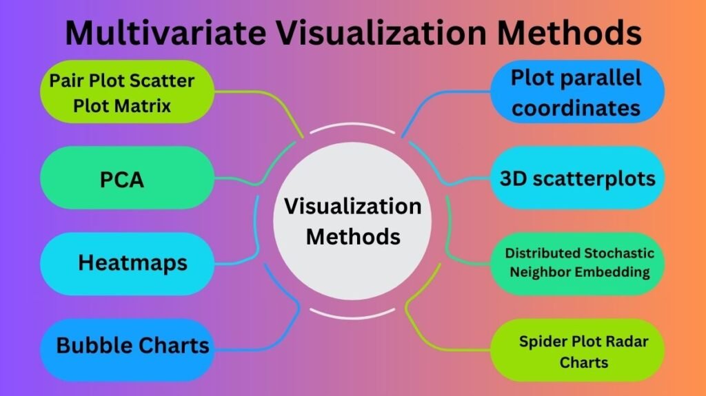
There are several ways to visualize multivariate data. Such methods include:

- Pair Plot Scatter Plot Matrix
One of the most popular ways to visualize multiple relationships is a scatter plot matrix or pair plot. A grid of scatter plots shows the relationship between two variables. The matrix is symmetric, displaying each dataset variable against all others. Pair plots show variables’ relationships and trends, clusters, and correlations.
Use Case: A scatter plot matrix might indicate age, income, and purchase amount correlations in a client purchase dataset. Findings may show patterns or segmentation opportunities.
- PCA
PCA reduces high-dimensional data to 2D or 3D while keeping variance. Principal components (highest variance directions) are identified in the data. These components are shown to show the data’s structure and identify clusters or patterns that may not be obvious in higher dimensions.
Use case: Genomic datasets with many variables are commonly analysed using PCA. PCA may show if data spontaneously clusters by attributes.
- Heatmaps
Heatmaps show multivariate data as a matrix with colors indicating variable pairs. Heatmaps show variable correlations well. The heatmap’s color scale shows correlation strength, making powerful positive, negative, and weak correlations easier to spot.
Use Case: A heatmap can show financial analysts which stocks move together and which are independent by showing the correlation between stock prices of different companies.
- Bubble Charts
Bubble charts are scatter plots with a third dimension added by depicting data points as bubbles whose sizes represent values of other variables. Adjusting the bubble size lets you see a third variable in addition to the x and y axes.
Use Case: A bubble chart can display sales, advertising expenditure, and product pricing. The x and y axes may reflect sales and price, while the bubble size represents advertising budget.
- Plot parallel coordinates
Parallel coordinates plots use vertical axes for each variable. Lines across these axes connect data points. This method shows how variables interact and how data points compare across dimensions. Parallel coordinates’ ability to handle multidimensional datasets is its key benefit.
Use Case: Plot age, income, product preferences, and purchase history to analyze client data. Seeing how lines clump together reveals customer behavior patterns.
- 3D scatterplots
3D scatter plots allow three variables to be viewed concurrently. Plotting data points in three dimensions helps visualize complex relationships. However, 3D charts can be difficult to read with many data points, therefore they are suitable for smaller datasets or exploratory reasons.
Use case: 3D scatter plots can show latitude, longitude, and elevation correlations in geographical studies and environmental monitoring.
- Distributed Stochastic Neighbor Embedding
Another dimensionality reduction tool for high-dimensional data visualization is t-SNE. Instead of PCA, t-SNE preserves local structures, making it ideal for displaying clusters in complicated datasets. For easier comprehension, t-SNE turns high-dimensional data into two or three dimensions.
Use Case: t-SNE is used in image recognition to visualize how image characteristics are clustered, revealing visual data structure.
- Spider Plot Radar Charts
Radar charts plot multivariate data with axes extending from a central point. You can compare variable values by connecting each data point by a line. This is handy for comparing performance indicators across categories or entities.
Use Case: Sports analytics may employ radar charts to compare athlete performance in speed, strength, endurance, and agility.
Best Multivariate Visualization Practices
Multivariate visualizations must follow basic practices to be effective and informative:
Simplification: Don’t overcrowd the plot. Concentrate on your analysis’s major variables and linkages.
Colour and Labelling: Label variables and clusters with consistent colour schemes. Proper axe and legend labeling is essential for plot interpretation.
Interactivity: Use interactive visualization tools to zoom in, filter data, or hover over points for more information. Detailed data exploration is easier.
Dimensionality Reduction:If the dataset has many variables, use PCA or t-SNE to make visualization more comprehensible and meaningful.
Context:Always provide the visualization context with titles, labels, and explanations. Viewers must easily understand the visualization.
Conclusion
Multivariate visualization helps data scientists analyze complex datasets, find links, and make informed conclusions. Scatter plot matrices, PCA, heatmaps, and parallel coordinate charts simplify high-dimensional data visualization. Data scientists can find insights, identify patterns, and improve their models using these methods, improving corporate analytics, healthcare, and other applications. Professionals working with multidimensional data will need multivariate visualization skills as data science evolves.